Diomni – lab workflow software

OVERVIEW
Diomni is an analytical software that comes with Thermo Fisher Scientific’s qPCR lab instruments (machines). qPCR instruments play a big part in biology and medicine by aiding scientists with genetic research, detecting pathogens, and analyzing DNA. It was heavily utilized during the Covid-19 pandemic to determine if samples tested positive for the coronavirus. Diomni software helps manage the qPCR process from the time a lab receives a test order, until the results are being shared back to the ordering party. Learn more about Diomni.
Role
My role includes moderating workshops, creating wireframes & prototypes, usability testing, and presenting work to stakeholders.
Tools
My tools include Figma for design, Axure for prototyping, Miro for workshops & planning, and Jira/Confluence for requirements.
Team
My team includes a project manager, business analyst, lab specialist, and several engineers.
A SAMPLE'S JOURNEY
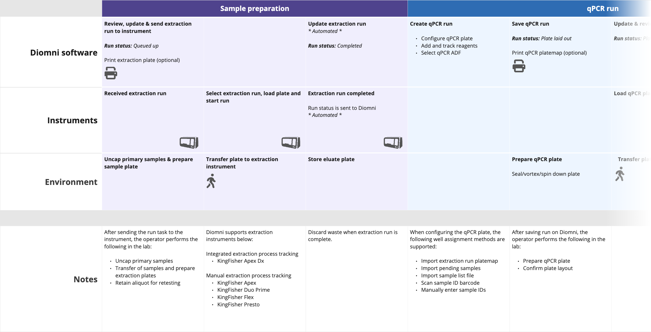
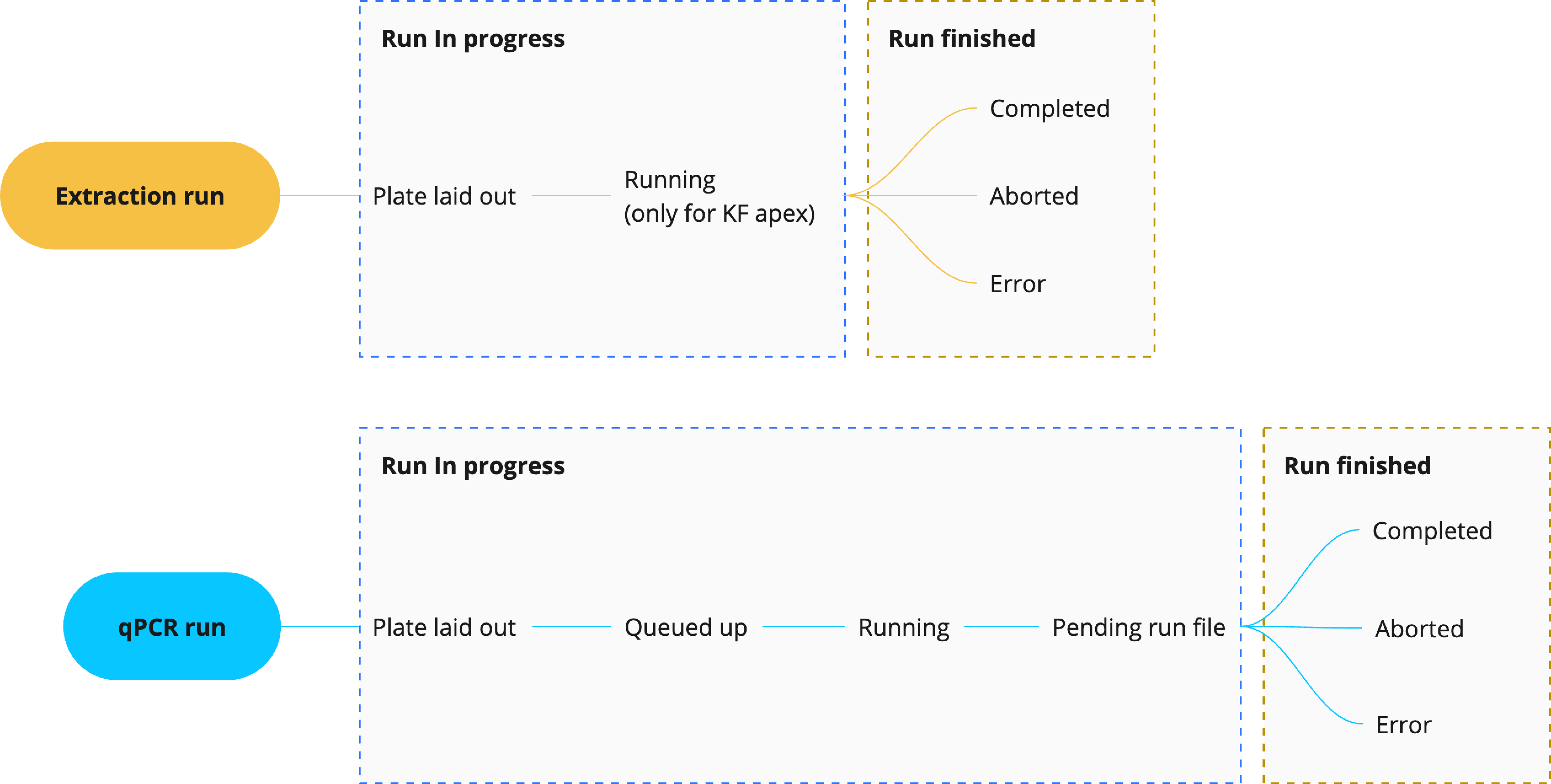
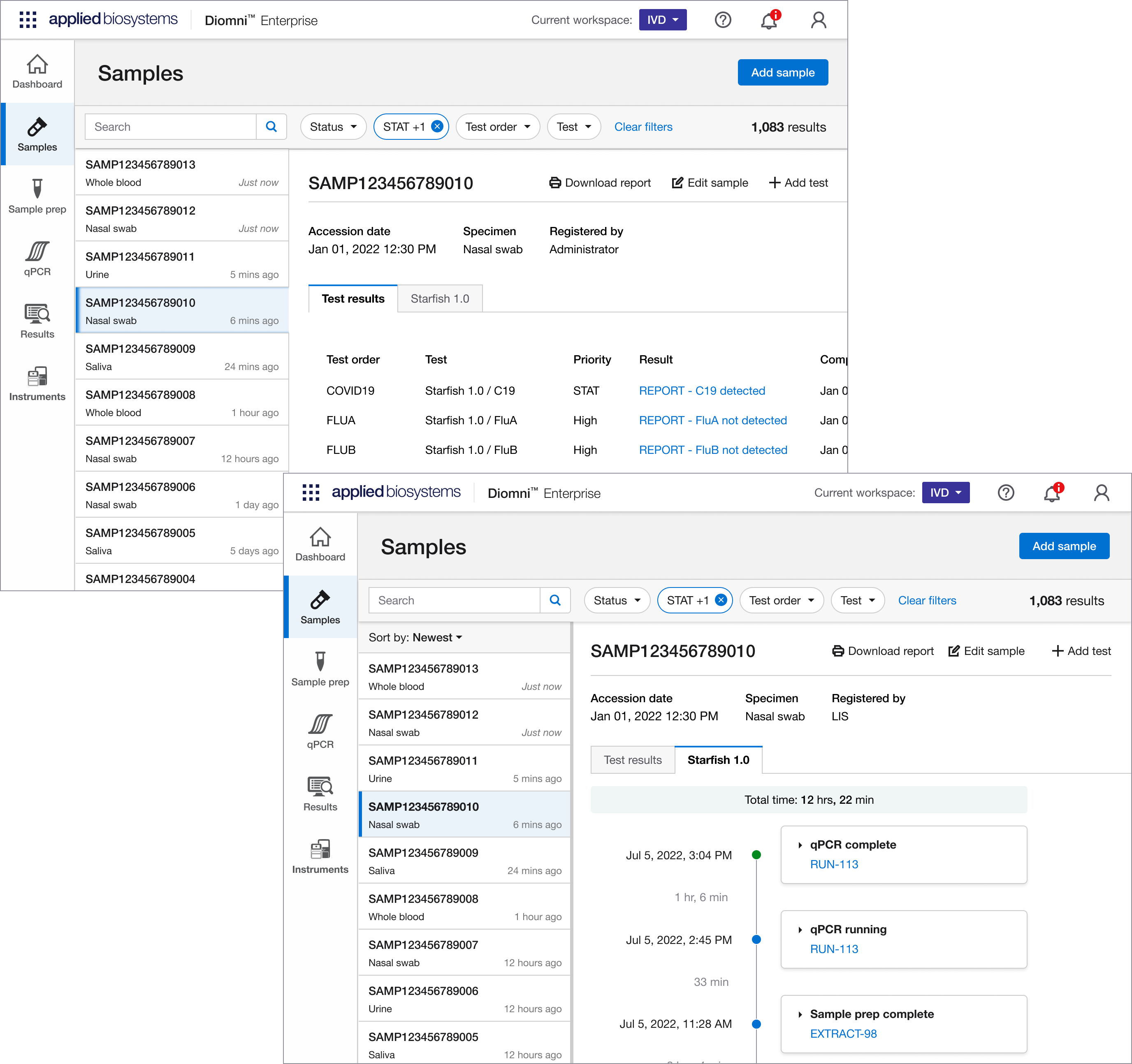
The labs using Diomni primarily deal with human samples, such as saliva or blood, to analyze and determine if someone has an infectious disease like Malaria or the Coronavirus. There are several stages a sample goes through, from the time it enters the lab until the results are reported back. It’s important for labs to know where a sample is in the process since they’re accountable to the ordering party, and may need to provide status updates. At the time, Diomni only associated samples with the tests performed on them, so we wanted to provide an additional view from the sample perspective, with tests associated to it. We called this new UI the sample dashboard.
What I did
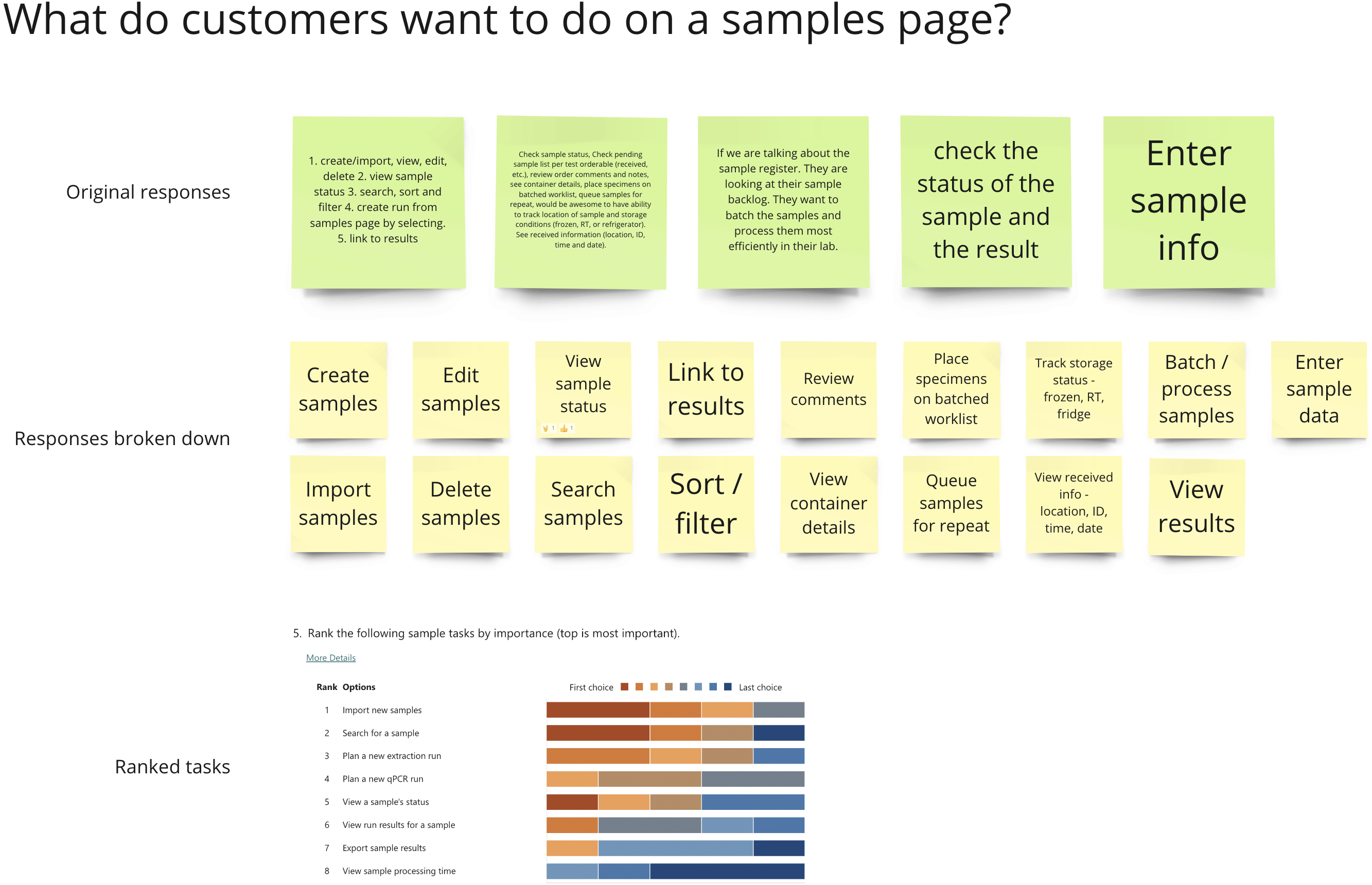
To support the sample journey and tracking, I sent out surveys to our field technicians to inform design. Based on that and other customer feedback we addressed the following objectives before presenting designs to technicians for additional feedback and ultimately a final design.
• Provide a central location for all samples processed in Diomni
• Provide a historical account of a sample’s tests with a timeline of the sample’s journey
• Support sample order intake from lab information systems
• Provide the means to add samples manually into the system
DISCOVERING INSTALLATION CHALLENGES
When our customers come to us, they’re purchasing an instrument to test samples, and the software is the accompanying product that supports the instrument. They also have to install additional administrative software to manage permissions and settings for Diomni and the instrument(s) it’s integrated with, so getting everything to work together is complex. We’re also regulated by the FDA, which can sometimes limit our options or add to the process and documentation. It’s a very heavy process just to get things installed and running.
What I did
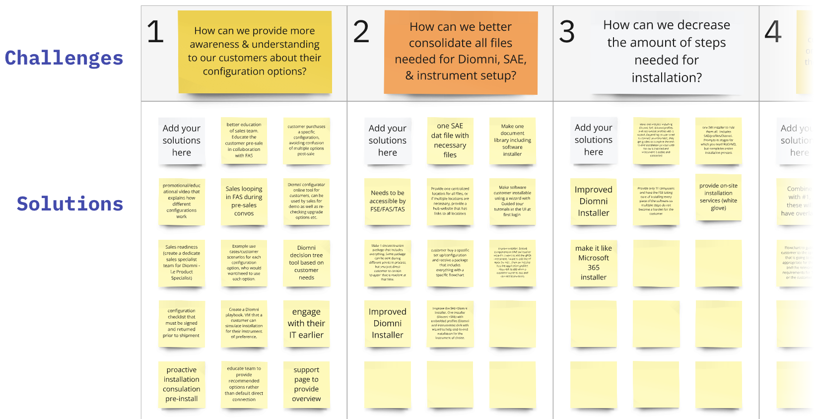
We had been receiving feedback that our software was difficult to install so I set out to identify what the issues were in the installation process. After talking with our customer service team, I identified five stages our customers had to go through from pre-installation (preparing the instrument and software for installation) through activating the license. With that as a starting point, I moderated workshops with our field technicians and asked them to do the following.
1. List the challenges within each stage of installation
2. Vote on the most important challenges to resolve so we could prioritize the top ones
3. Propose solutions for the top challenges
What I discovered
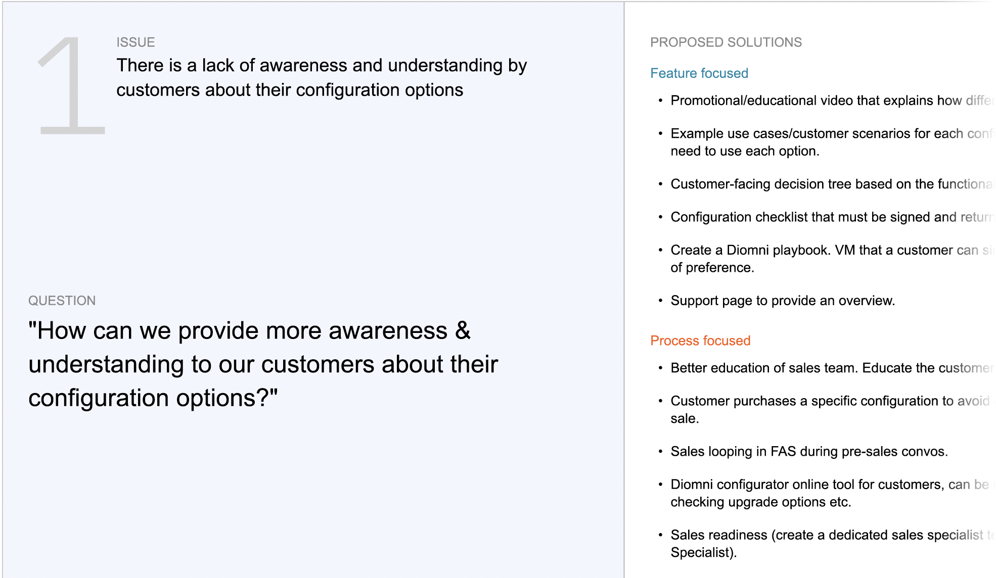
At a high level I found themes around fragmentation, lack of awareness, communication, and documentation. At a more granular level I found fifteen top issues, the top three of which were the following.
#1 Lack of awareness and understanding by customers about their configuration options
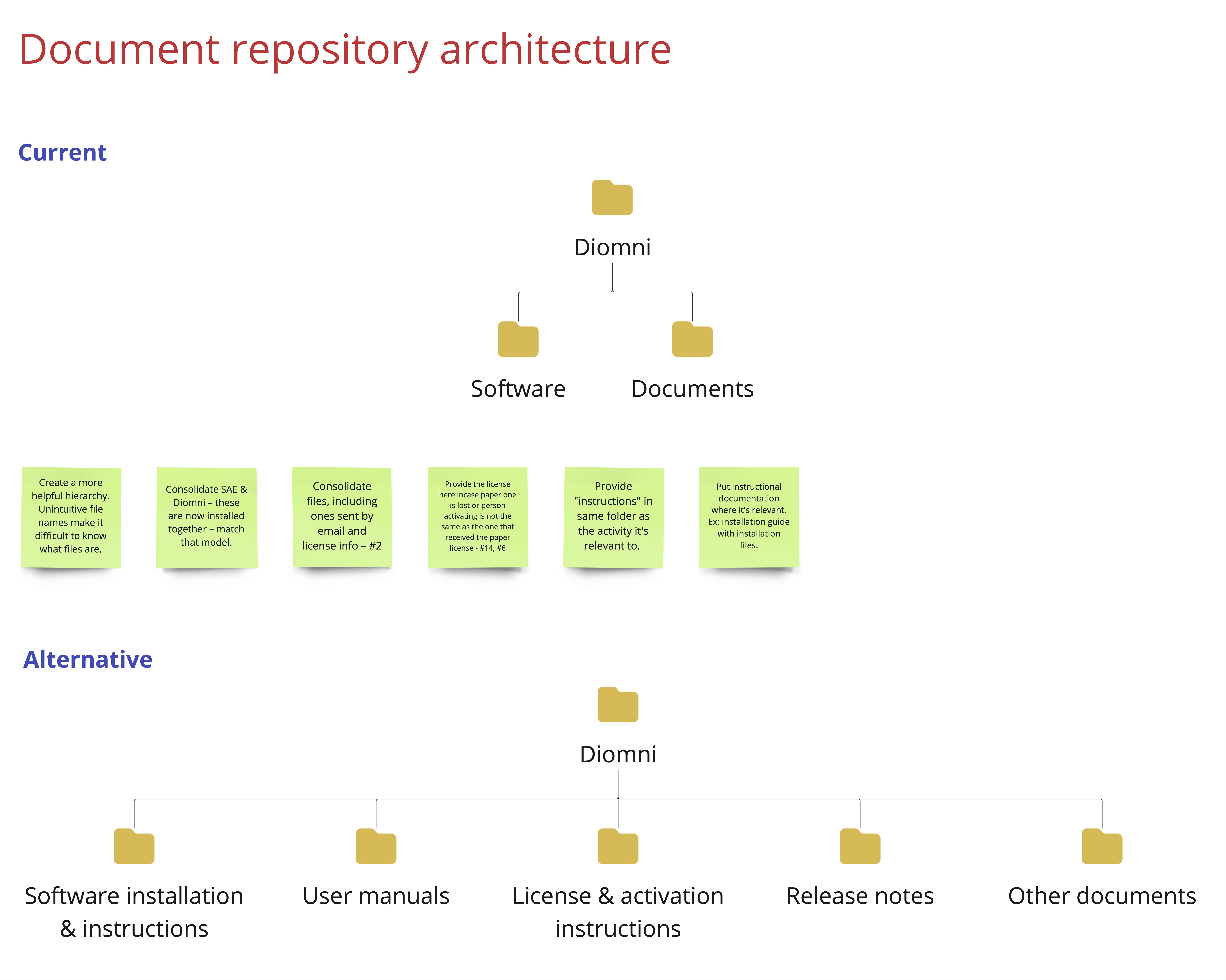
#2 No single source to get all files required for Diomni, SAE, and instrument setup
#3 Too many steps, located in different places, to install and configure the software
SMOOTH LANDING
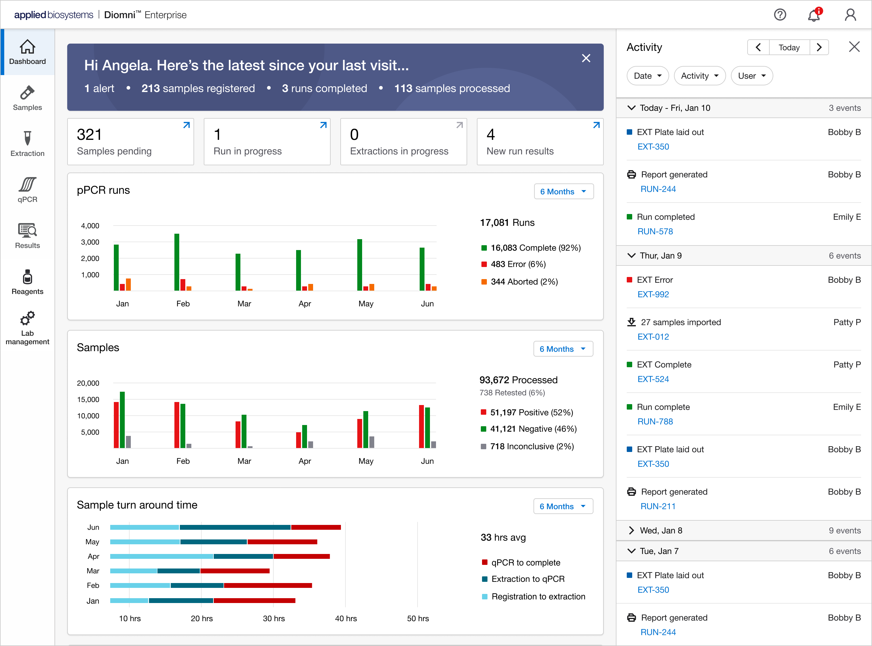
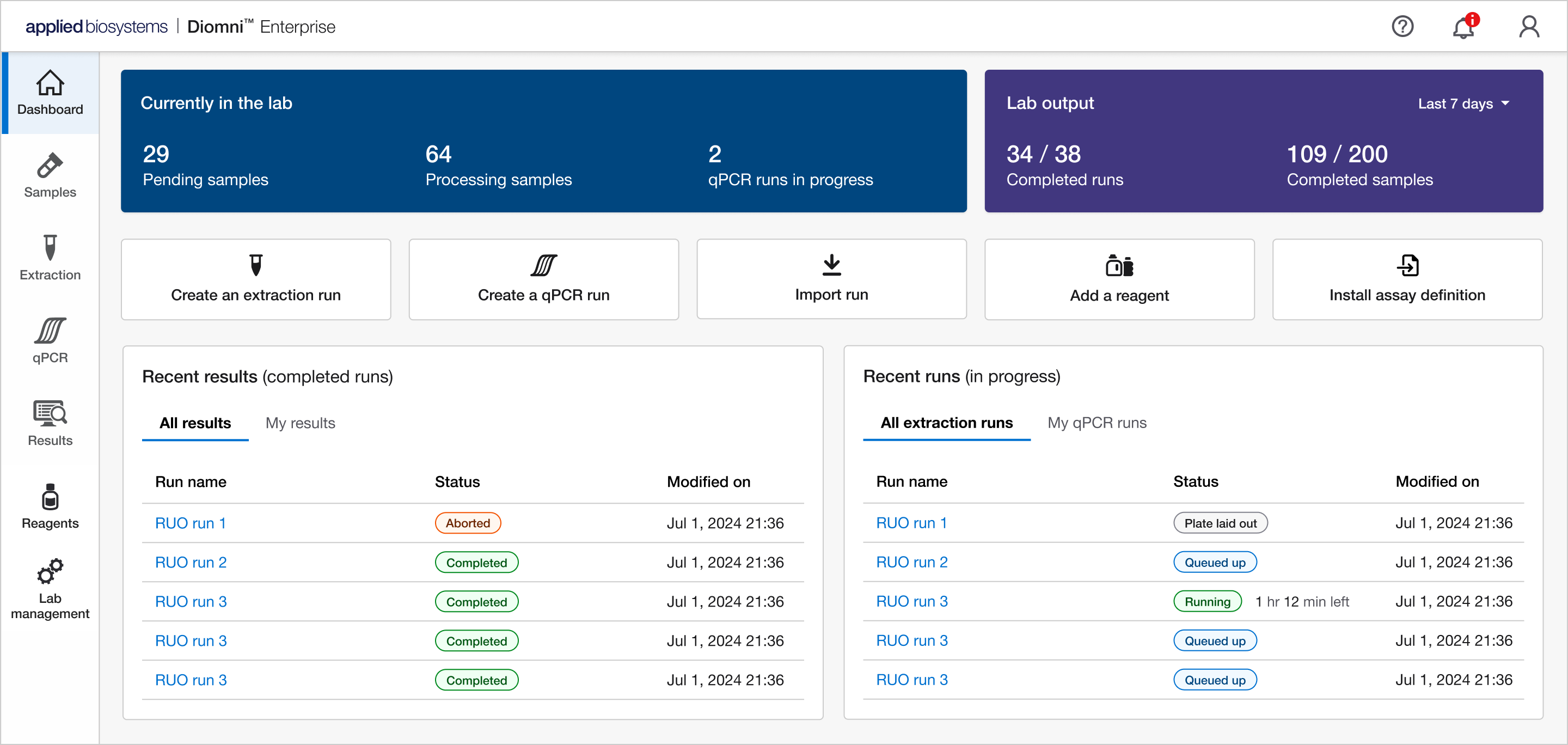
Every product needs a landing page / dashboard and after understanding our customers, my goal was to provide them with entries into the most common tasks, display actionable items, and provide some high level metrics the lab managers would appreciate.
What I did
Originally, I had come up with a very metric-centric dashboard. While it was visually interesting, it was geared towards more of an admin/manager role. The majority of our users were lab technicians, so I changed direction towards a more work-centric UI while still incorporating a few metrics a manager would appreciate. Conceptually, from top to bottom, I wanted first to provide them statistics about what was happening in the lab. From this information, they could then decide if they wanted to perform any task which is provided in the second area. Lastly, there's the work that has been completed represented by two widgets.

INSTRUMENTS & LICENSING
Once the physical instrument is installed in the customer’s lab, they can connect it in the software. The primary workflows in Diomni rely on instrument connection to plan and run tests. In addition, our licensing model is tied directly to each connected instrument. There was an existing UI for connecting and managing instruments, but it had some usability issues we wanted to address. I also needed to create a flow from that UI for users to register the instrument with a purchased license to enable access to all features.
What I did
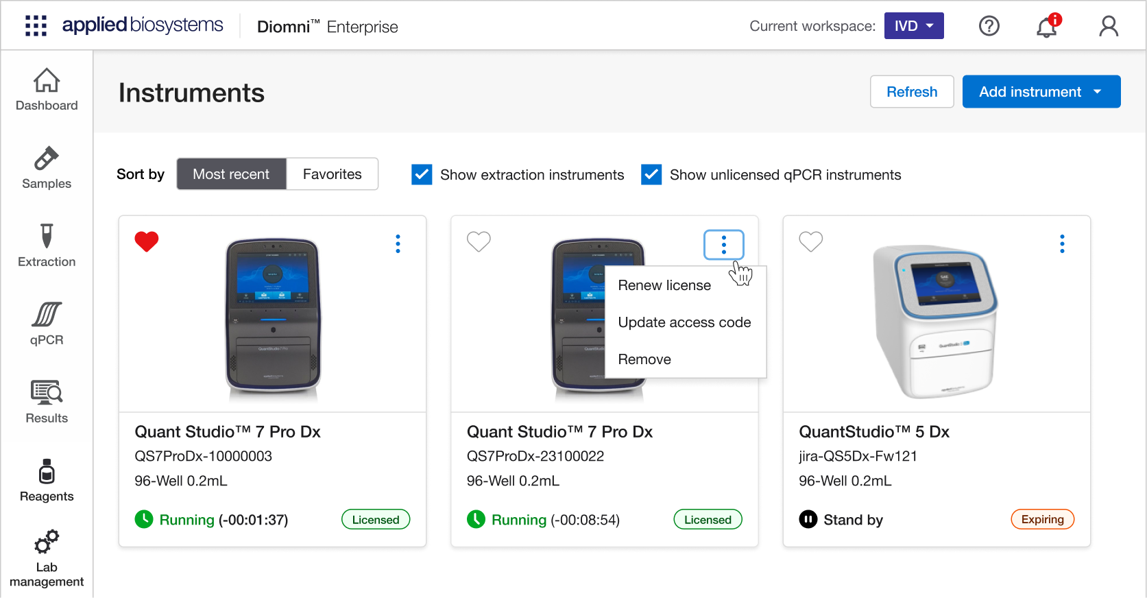
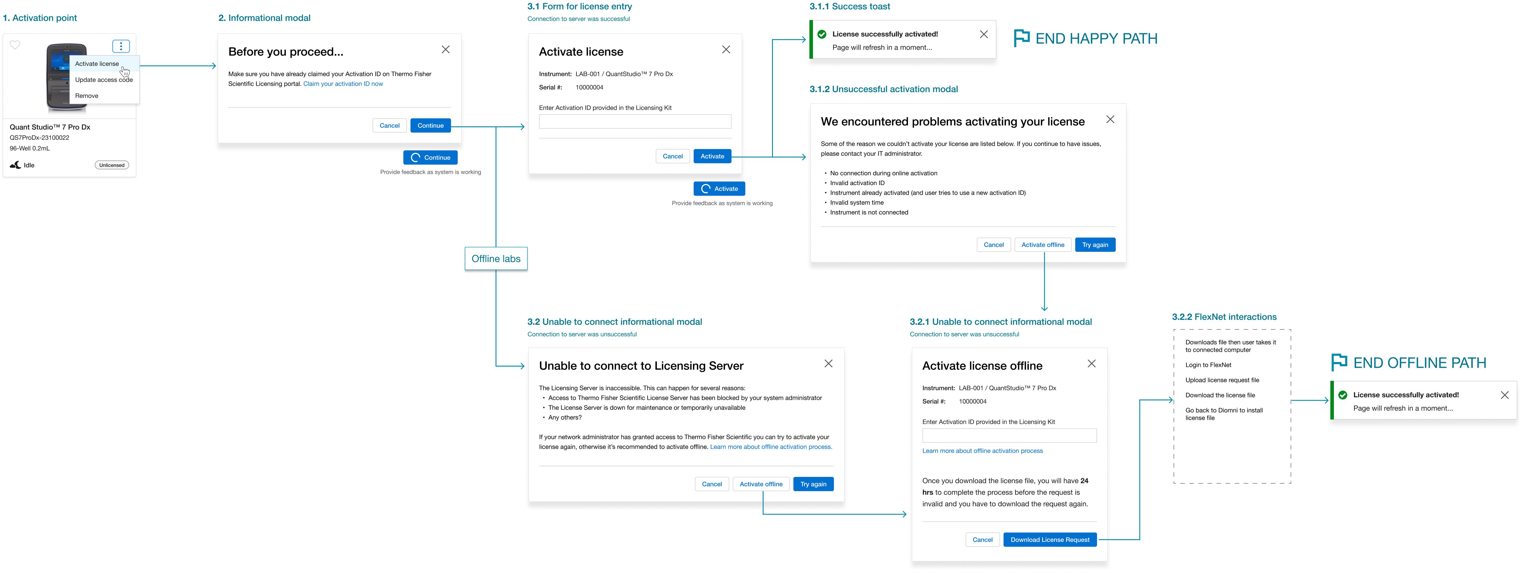
We had noted usability issues for the instruments page. The patterns implemented were uncommon for the average user, so I updated the UI with more common controls and patterns. Associating a license to an instrument was more challenging due to constraints we had with our licensing portal and labs that are air-gapped (no internet connection) for security reasons. I created two flows, one for labs with connectivity and one for those without.
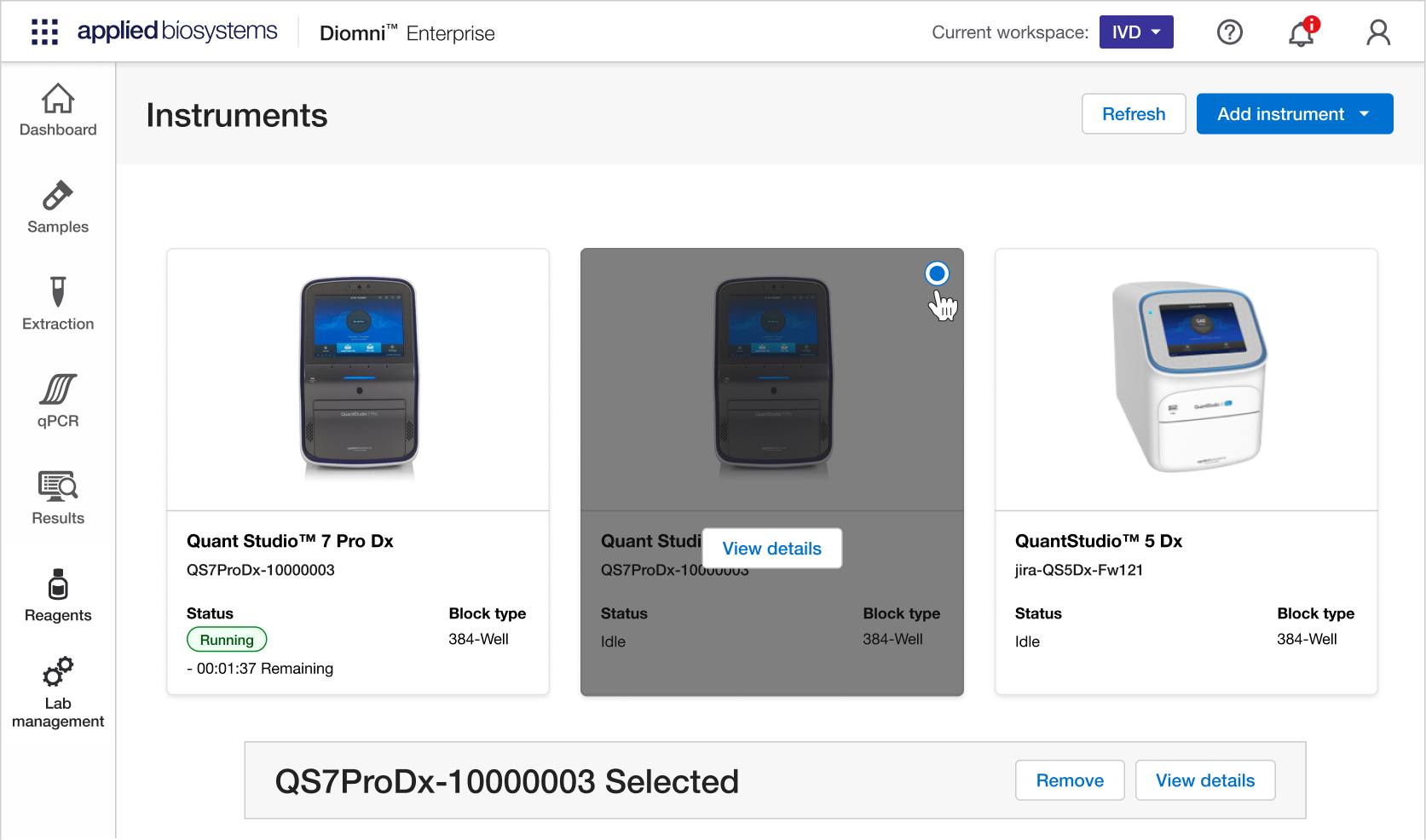
• Adding an empty state to the page
• Adding sorting and filtering to the page
• Adding tooltips for disabled areas on cards
REAGENTS
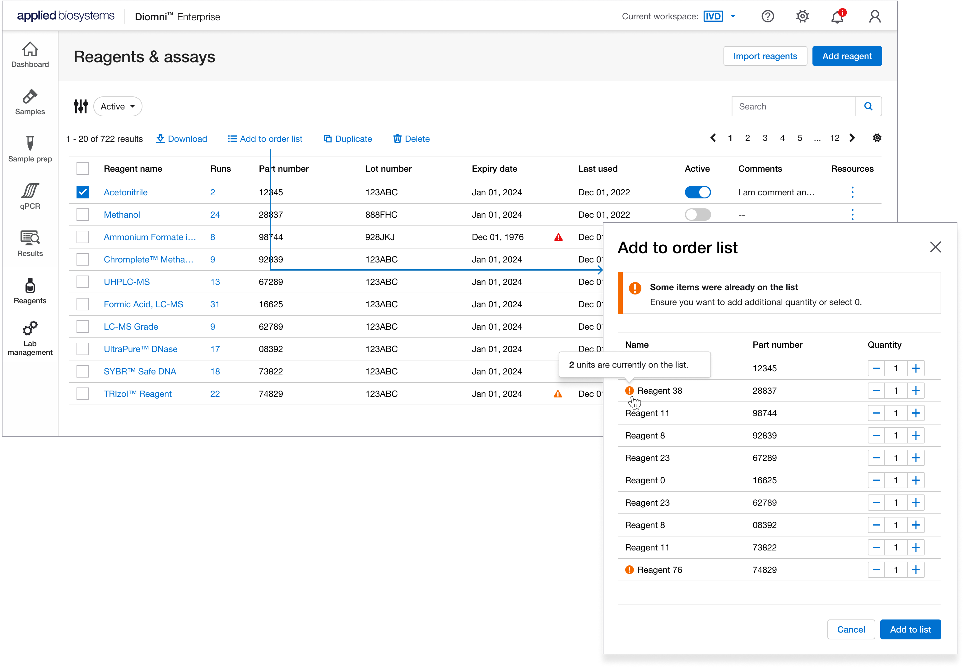
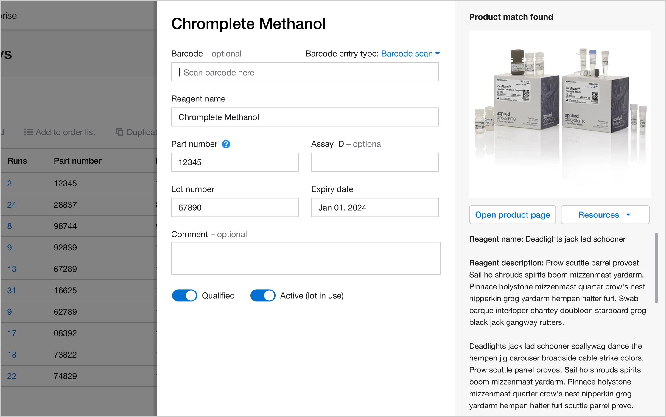
Reagents are the chemicals mixed in with samples during a qPCR test to help find and measure specific genetic material that will in turn help determine the results of the test. Since it’s also a product we sold as a company, we wanted to support the product ecosystem by helping them track their usage and reordering from the software.
What I did
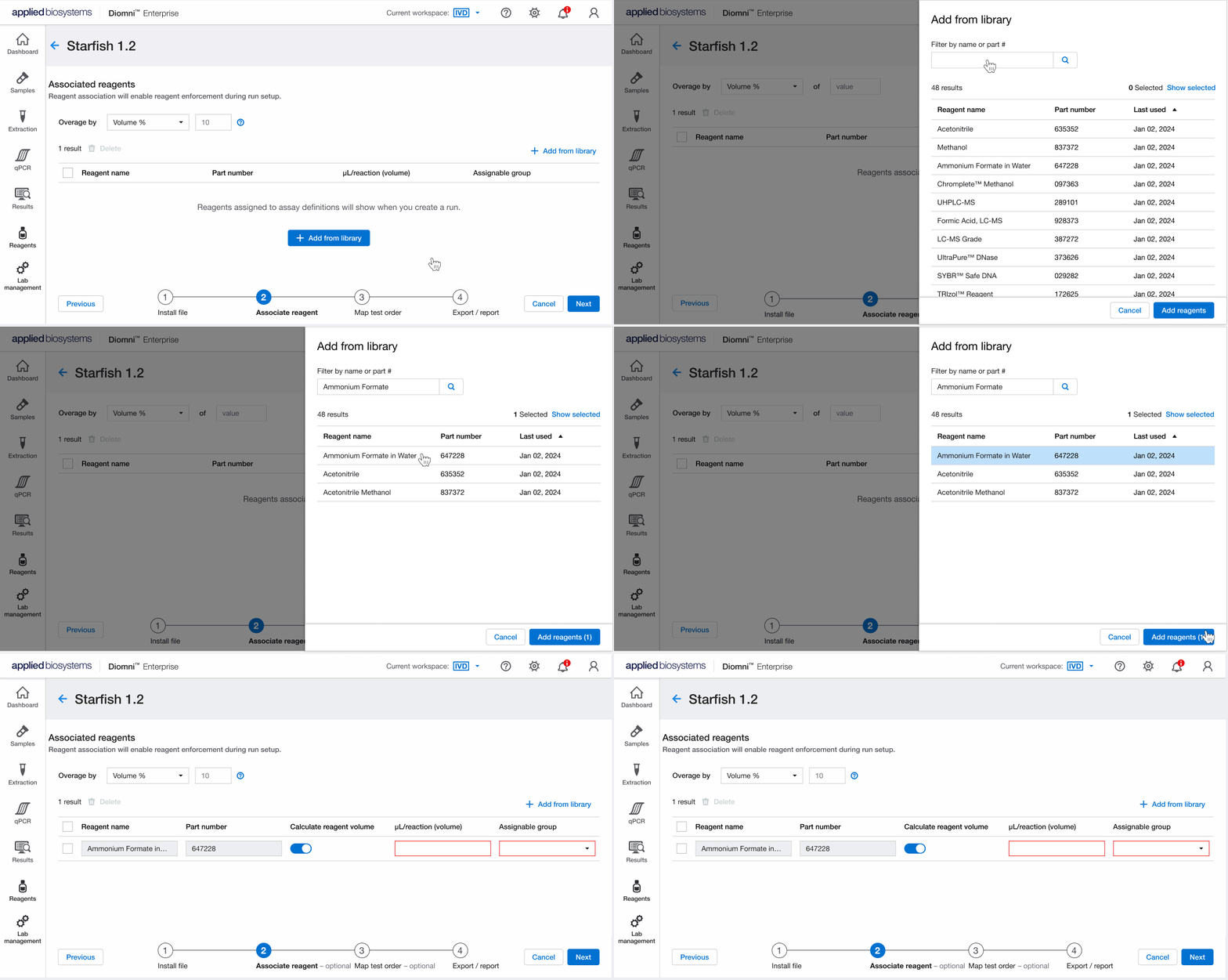
Besides user needs, there’s also the business needs in product development which is where the bulk of the requirements came from for this. We had previously let users note the reagents they used in tests but there wasn’t a central location they could go to see individual reagents and their usage in tests. Besides providing them a central location and facilitating the reordering process, we also gave lab administrators more control over what regents the lab technicians could use while performing a test. Once my designs were completed and run by the team, I used an interactive prototype to test six people and make updates from their feedback and my observations.
FINAL THOUGHTS
As a new and niche product, Diomni has a smaller customer base. However, we've been actively collaborating with the US government to fulfill their specific requirements for qPCR software and anticipate a forthcoming partnership.
There were a lot of challenges with this project. We’re regulated by the FDA, many of our customer’s labs don’t have internet (precluding automated software updates and analytics), and as a remote team in a larger company, collaboration can be difficult. There’s also the challenge of a non-scientist like myself, trying to keep up on the subject matter but that's helped me to refine my research techniques.