Design system
OVERVIEW
As I was just starting a new role at Thermo Fisher Scientific (science instruments company), there was global UX initiative to move from one design tool – Sketch, to another – Figma. The group I was under, Genetics, also had a need to build a component library unique to it's products. New to Figma myself, I saw an opportunity to gain expertise in the tool so I volunteered to lead the effort.
Problem
With the amount of digital products and teams Thermo Fisher genetics division has globally, there is a lack of visual and interaction consistency that can have an impact on the brand experience.
Solution
Provide reusable design components and usage documentation for designers and development teams to improve consistency and implementation.
PROCESS & TEAM
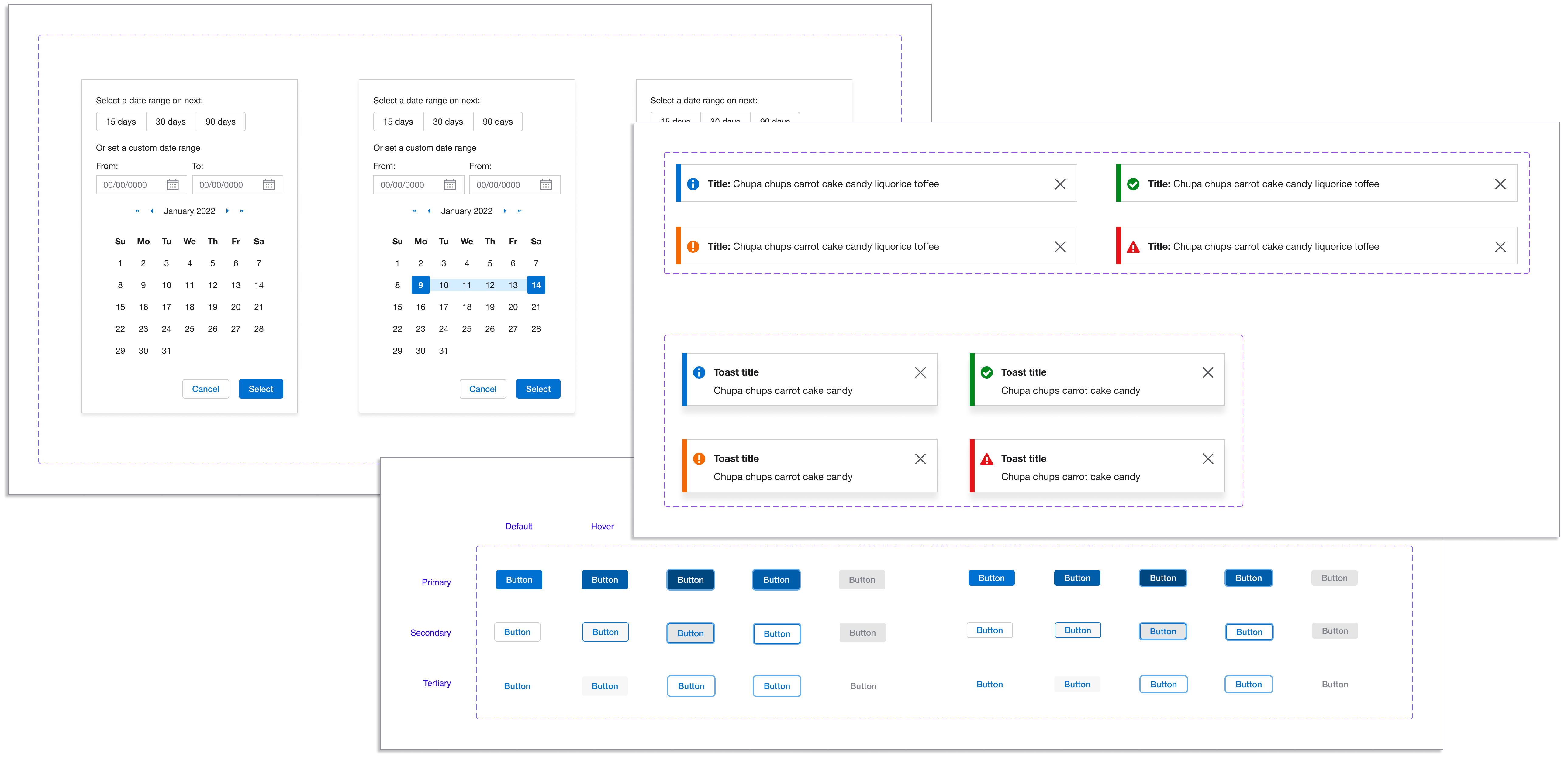
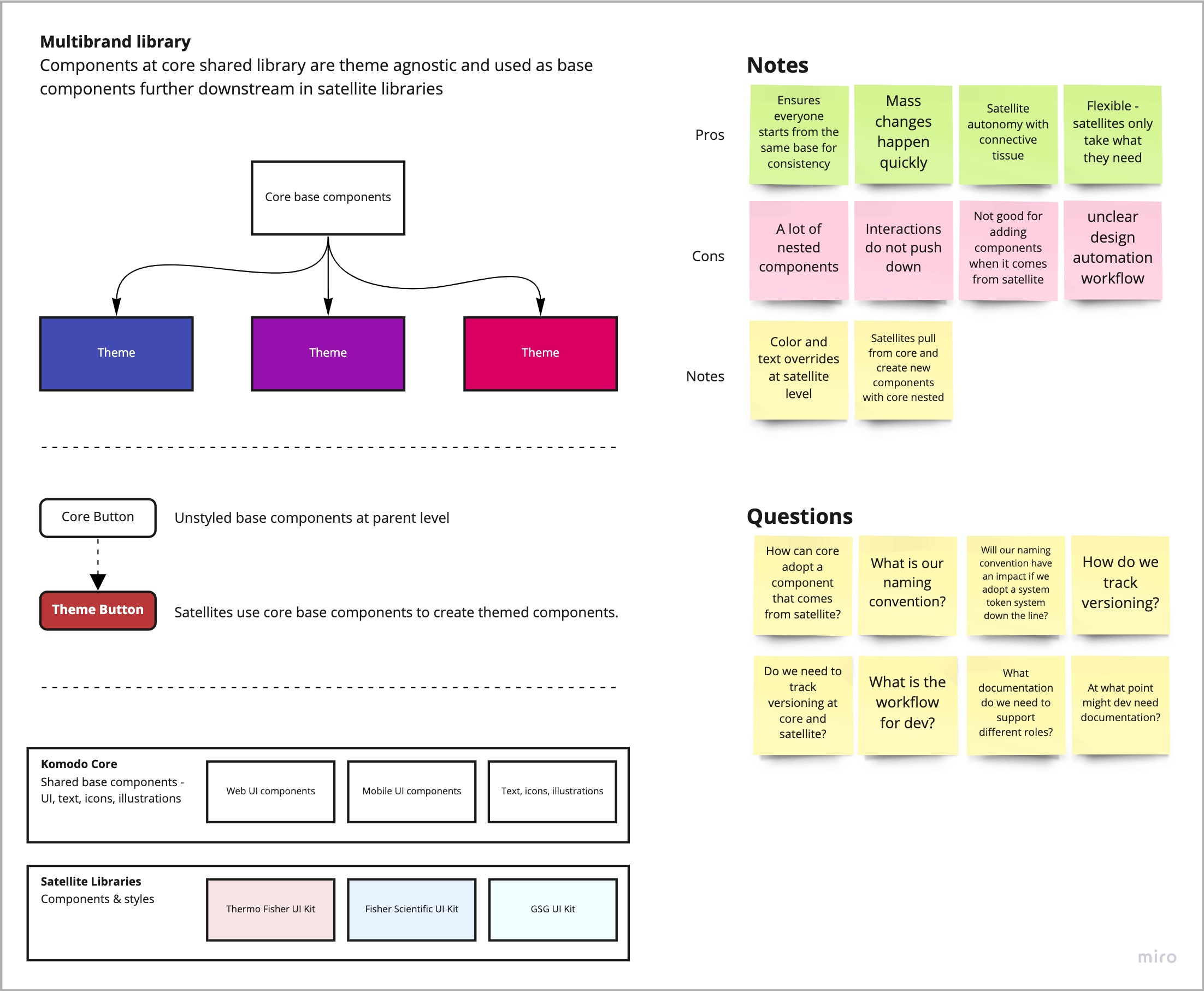
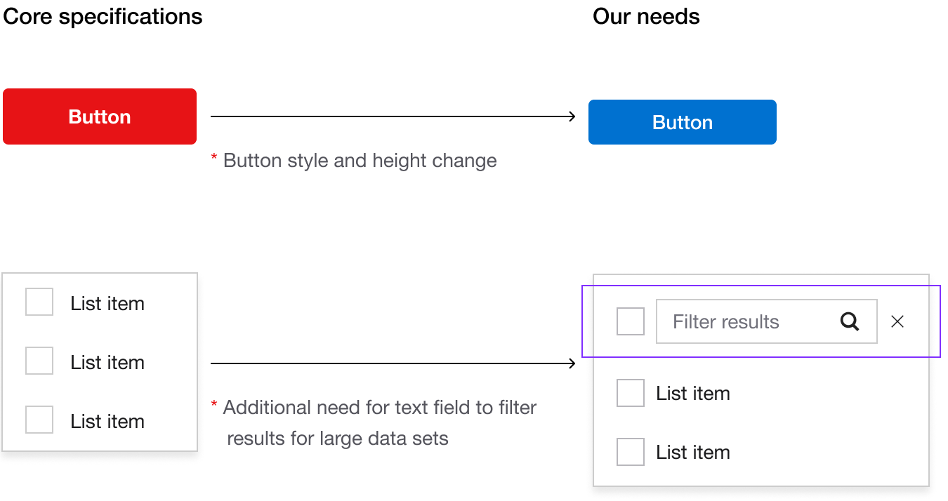
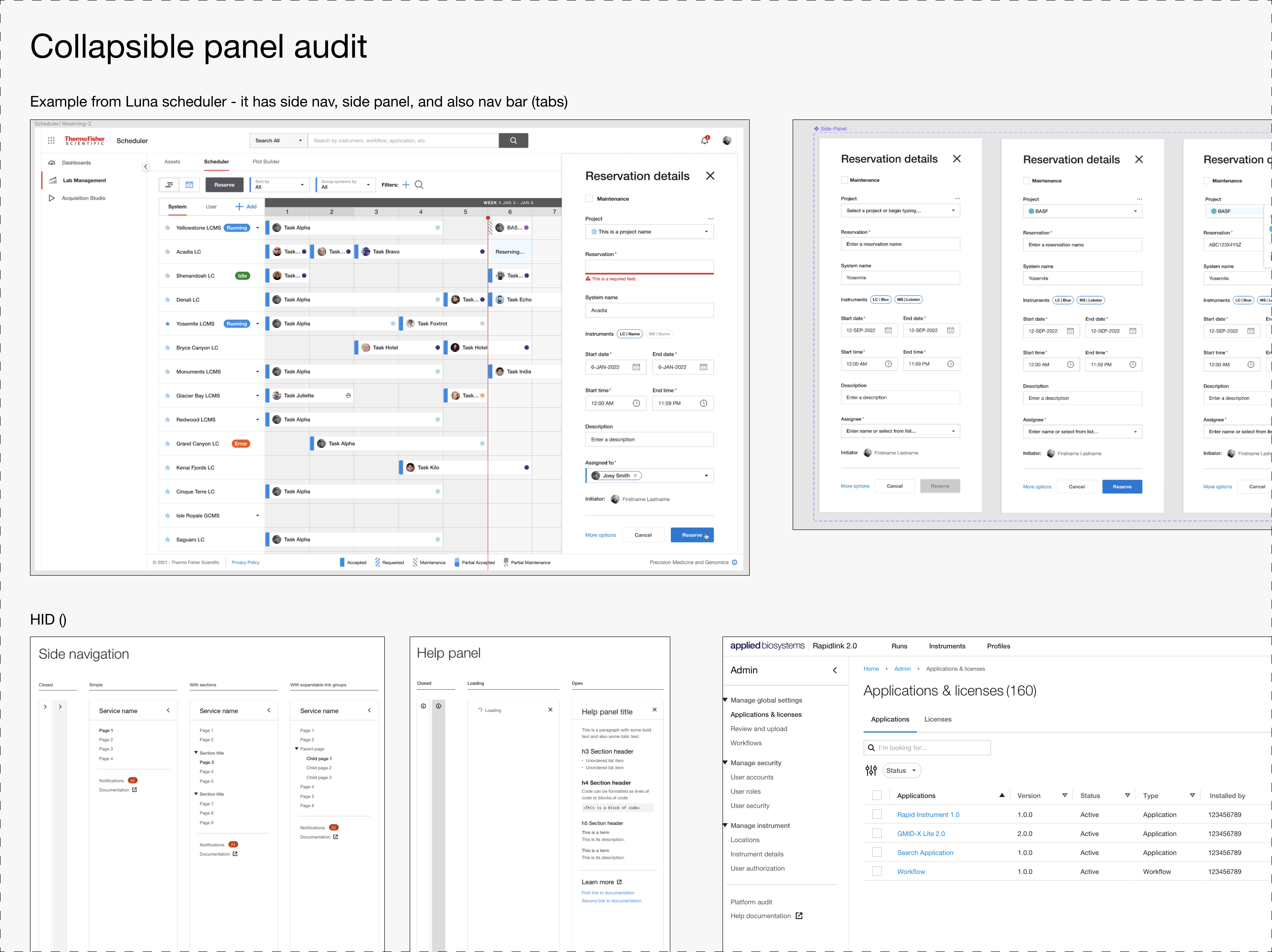
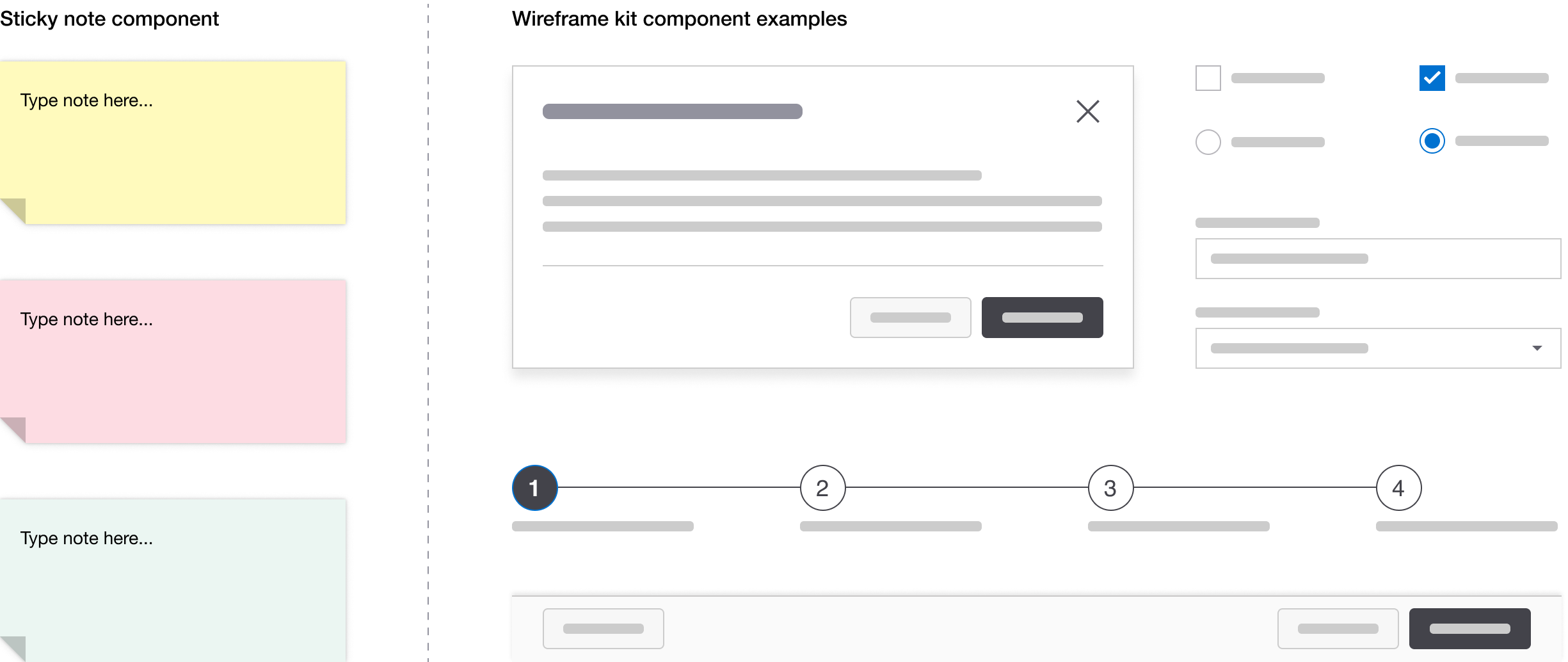
Building the components in Figma was done by me and another designer as a side project over the course of 5 months. We divided the file into three sections – Work in progress, Ready for review, and Completed. I asked the other designers that would use the library to drop screen shots of similar components from their projects into the designated component space. I lead weekly discussions with five other designers and discussed components that were ready for review. I took their feedback and iterated or moved the component to the completed category.
SUPPORTING DOCUMENTATION
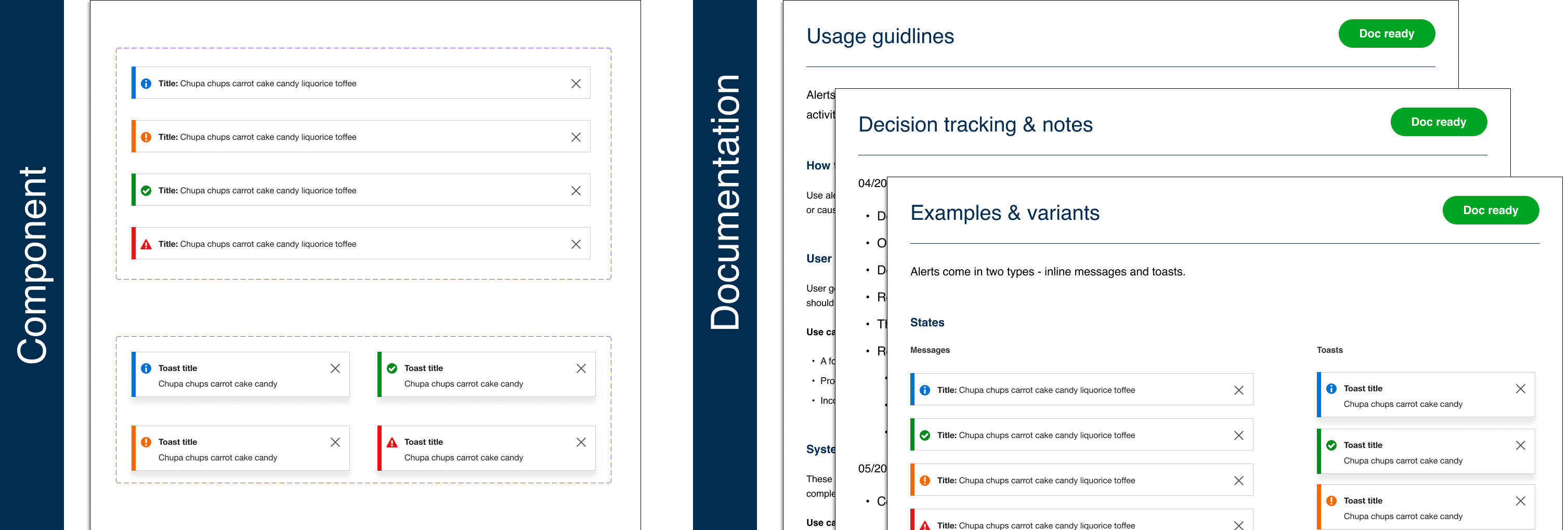
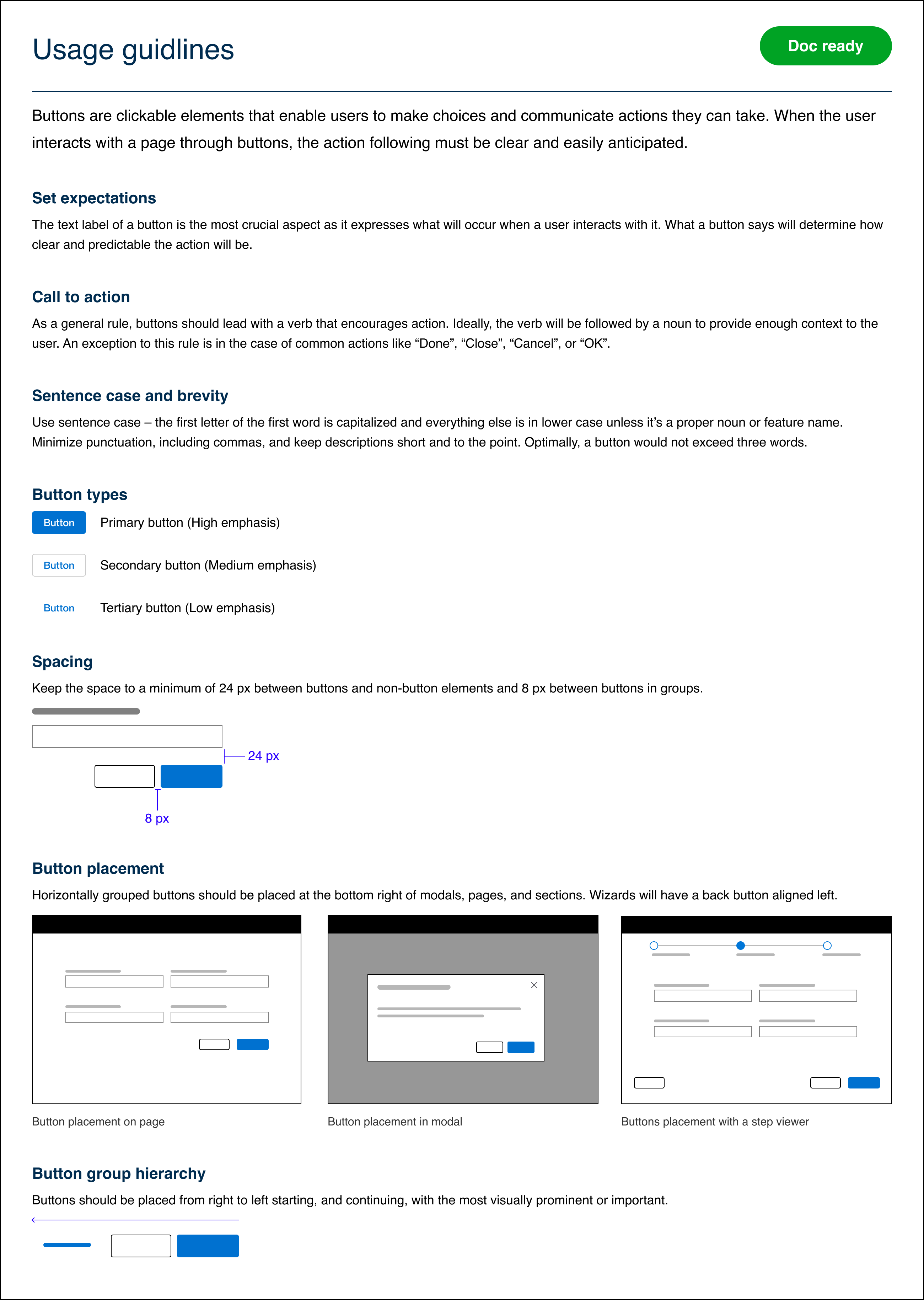
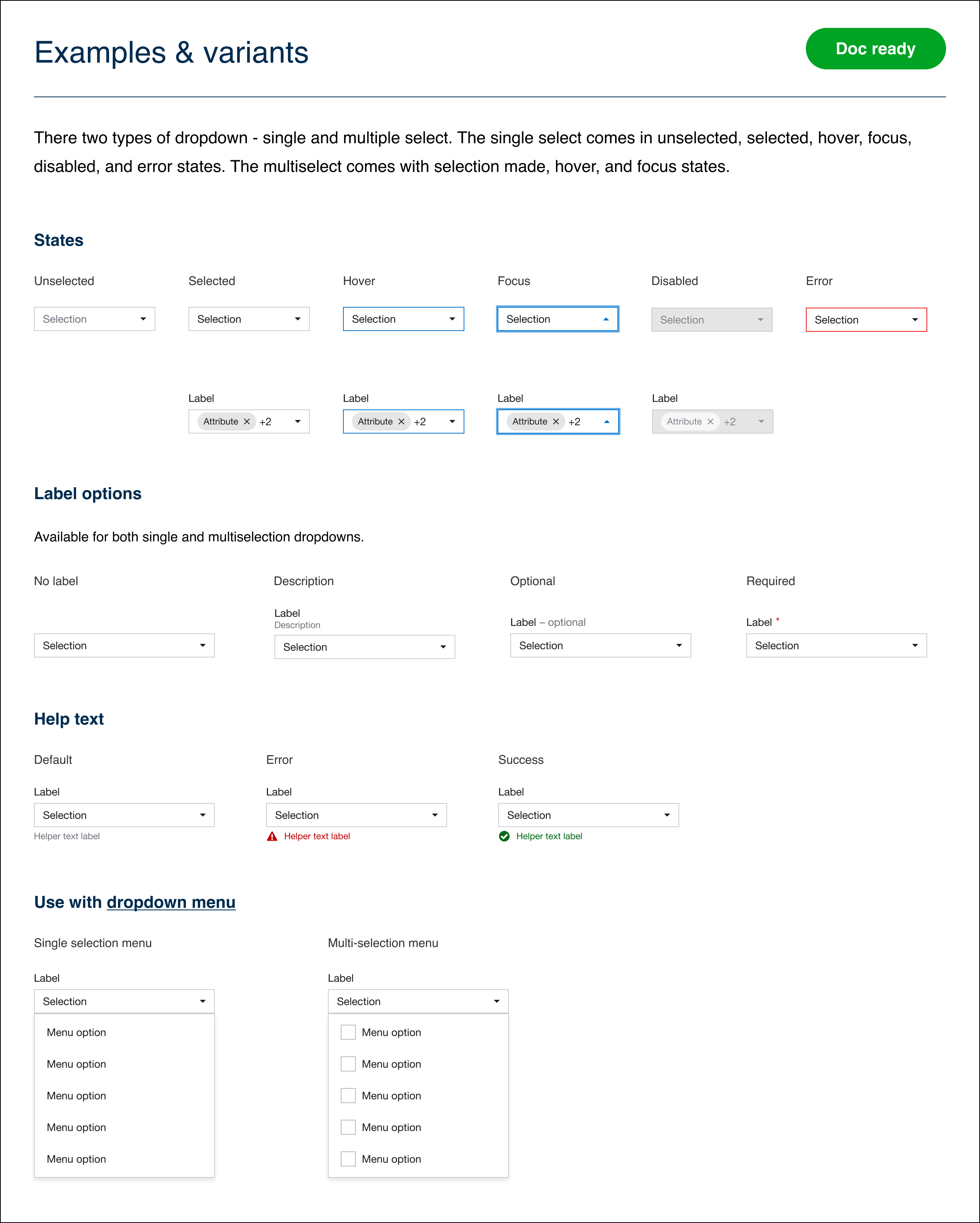
Once we completed the components, I started to work on supporting documentation that would include Usage guidelines, Examples, and Decision tracking. Similarly to what we did with components, I lead weekly discussions to determine the usage rules around each component. Fun stuff, like should the space between two buttons be 8 px or 12 px. It actually was fun to have these debates and I learned a lot from other's perspectives.
FINAL THOUGHTS
I very happy to have done this for the knowledge I gained in Figma. I feel very confident with the tool and have since lead small class sessions on the tool for others that are still getting used to it. I lead weekly design critiques and have opened it up to include Figma topics. I'm happy to say that the component library has been adopted and implemented into our group but will always be a work in progress.